What we really want is a landing page that converts.
Everyone loves a good-looking landing page! Some brands want theirs to look sexy, alluring, irresistible, and gorgeous. All for the purpose of capturing customer attention at the first second!
But, what many forgot to remember is, a good landing page is more than just looks! Of course, we want the best brand representation, but if it does not sell, what is the purpose?
Here is a SHORTCUT for generating High-Converting Landing Pages:
- Have a contextual and strong Hero Image.
- Present ONLY a single and focused Call To Action (CTA).
- Compelling headers and subheads that solve problems.
- Include testimonials and other forms of social proof.
So if you want to create websites, or find a web designer to do it for you, here are 6 High-Converting Landing Page Examples that you can inspire on.
1. PANDORA
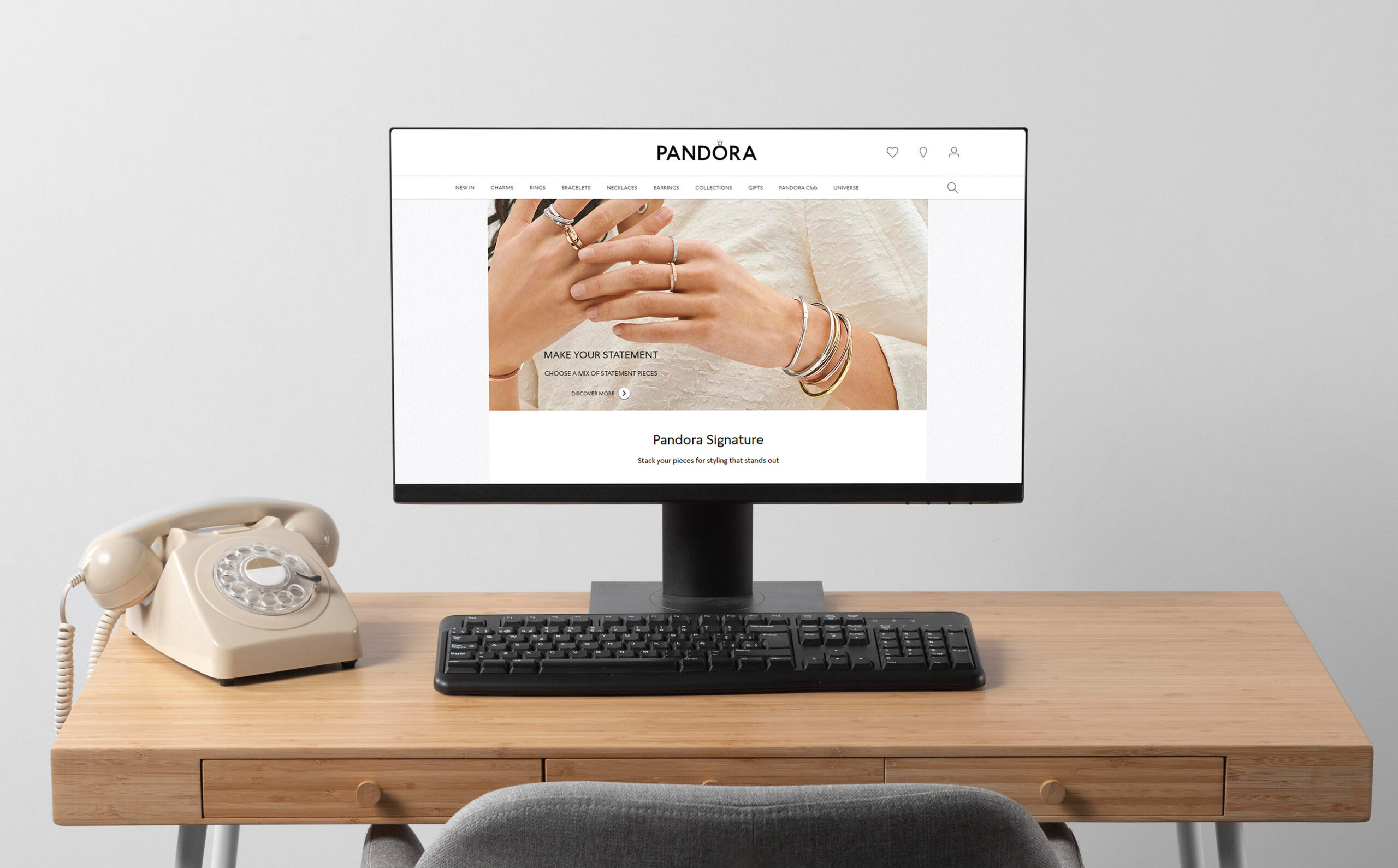
Industry: Fashion & Beauty – Increased Conversion Rate by 130%
When it comes to Girl’s Best Friend, it must be all about the jewelry pieces themselves! To compel customers, they created a landing page free of distractions!
Instead of lengthy clutters, they highlight the products using dazzling images, clear headlines and push forward the most unique items from the collection.
2. Backlinko
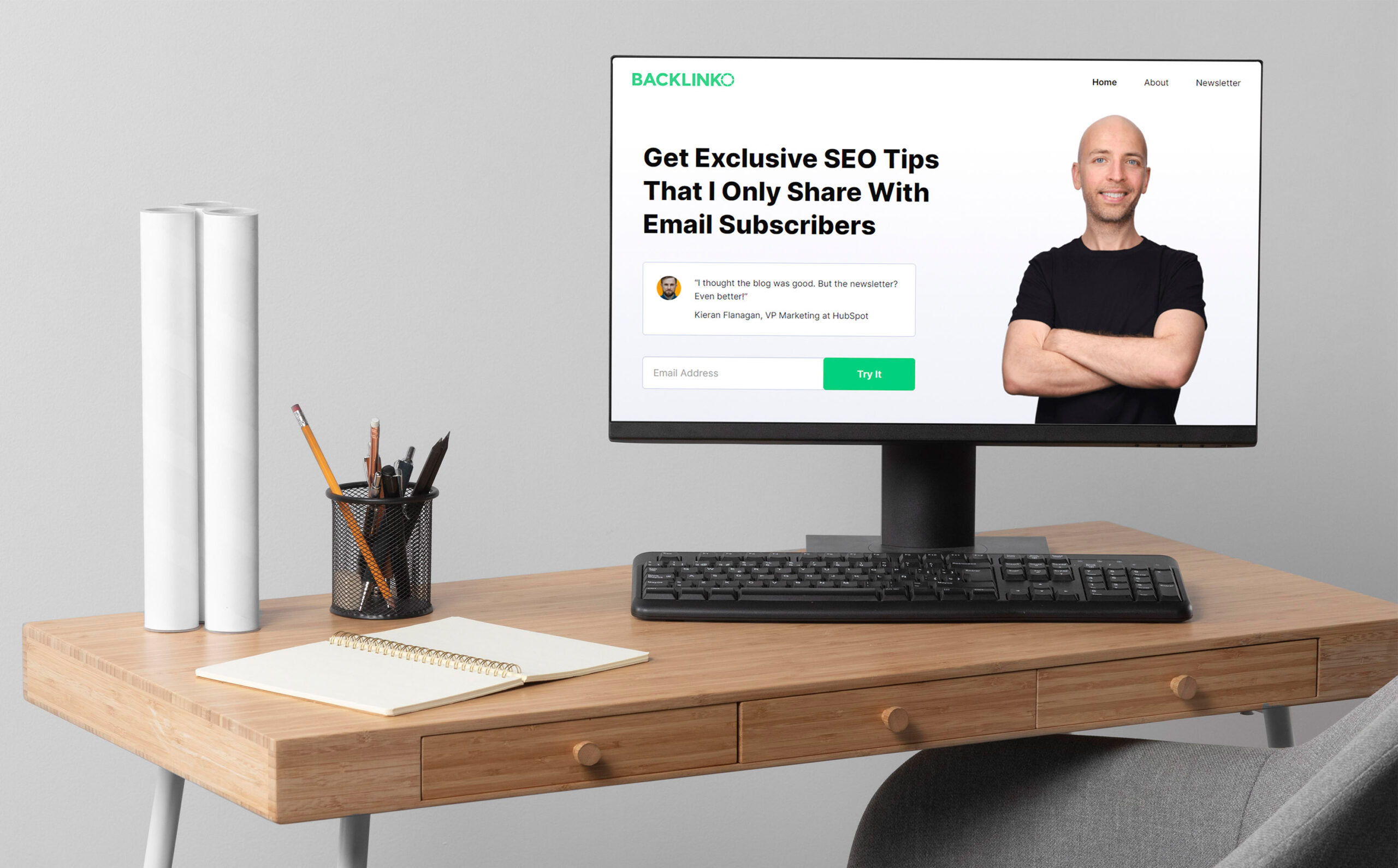
Industry: Business – Increased Conversion Rate by 10%
One cheat sheet you can do to make your landing page more converting is by adding a second CTA below the fold. By just adding this, the landing page can increase their conversions by 10%.
Visitors are too ‘lazy’ to scroll, so it is best to always put your CTA strategically! Ideally, it should be in sections where values, social proof, or credibility content are placed. Try to have a look, and learn from them!
3. ConvertFlow
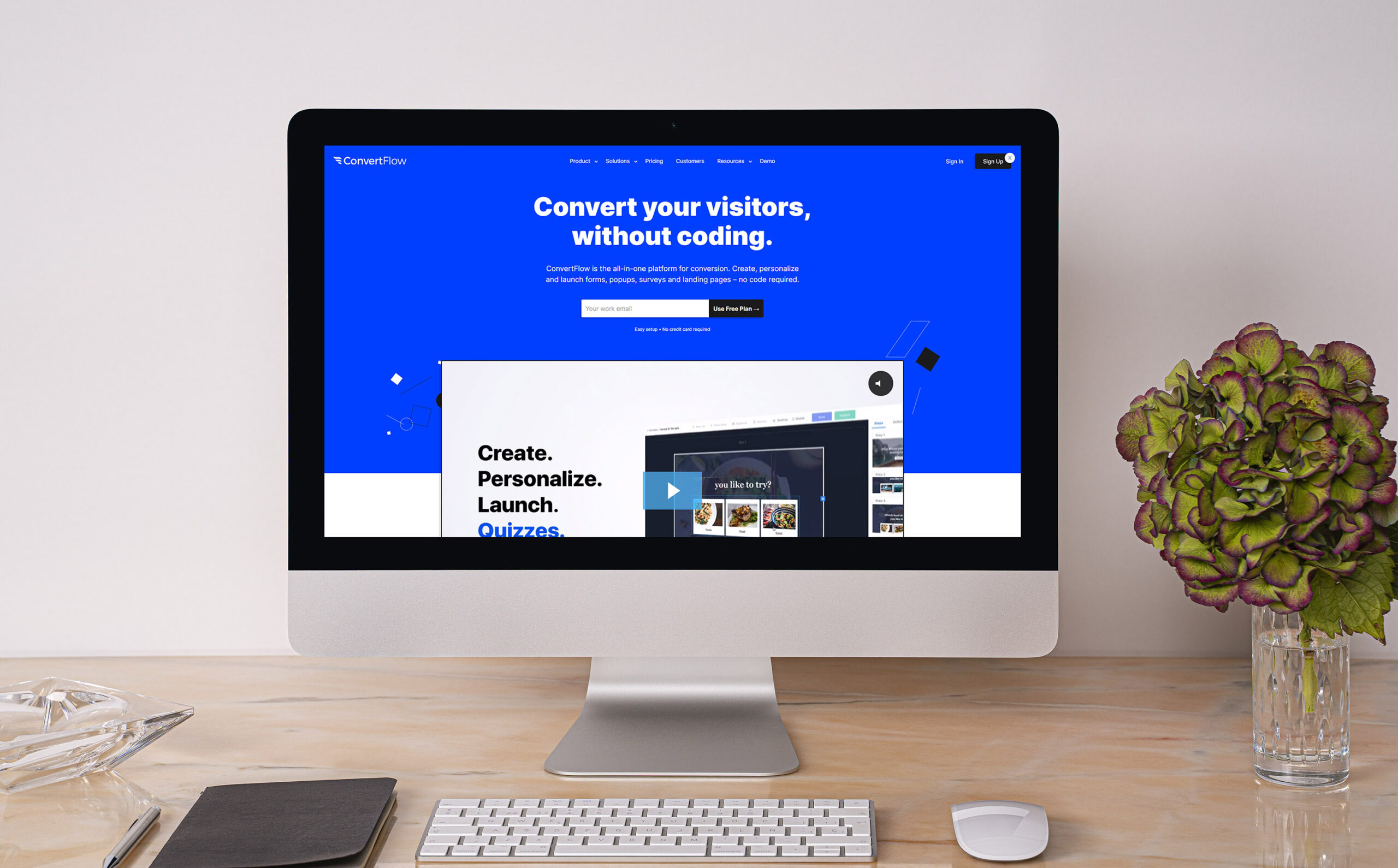
Industry: Digital marketing, lead generation – Simple, sleek, and personalized
Their sole business is taking leads! So, you might want to learn from them!
The design is simple and trim. It includes all the necessary information. Just enough to educate the visitors and prompt them to fill out the form. This is the best example of a short and powerful landing page!
So, be strategic with your content rather than design!
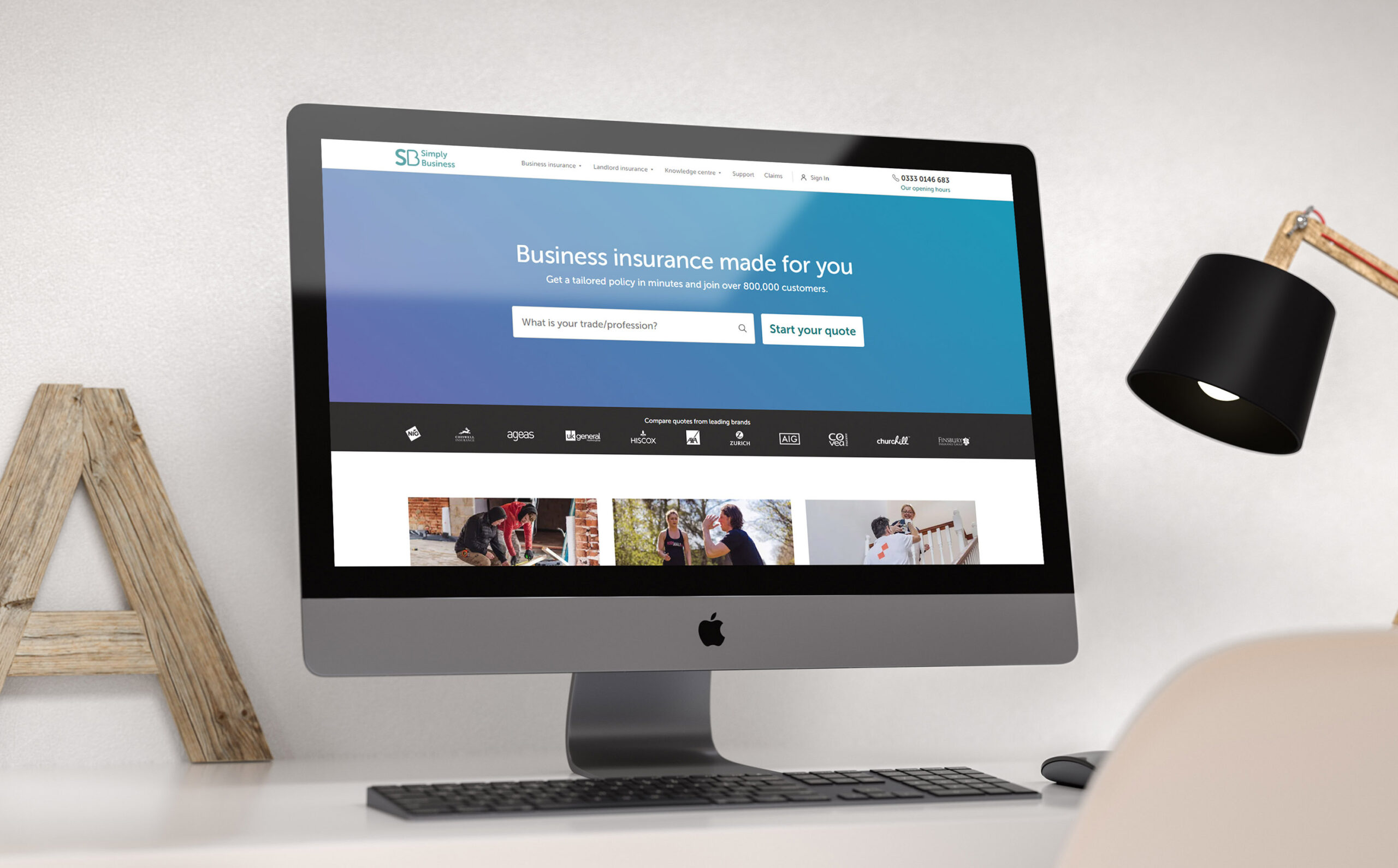
4. Simply Business
Industry: Insurance – Conversion Rate: 62.26%
Their strategy is ‘uncomplicating’ complicated products!
Insurance has always been a complex product. Sometimes, even the buyers themselves do not understand 100% of the things they buy. So, to make sure their customers have just enough info about their products, they present their content in Layman’s terms.
Make it sound like a casual day-to-day conversation. No need to feed customers with all your claims, benefits, features, etc. Instead, focus on how your products can solve their problems the simplest way!
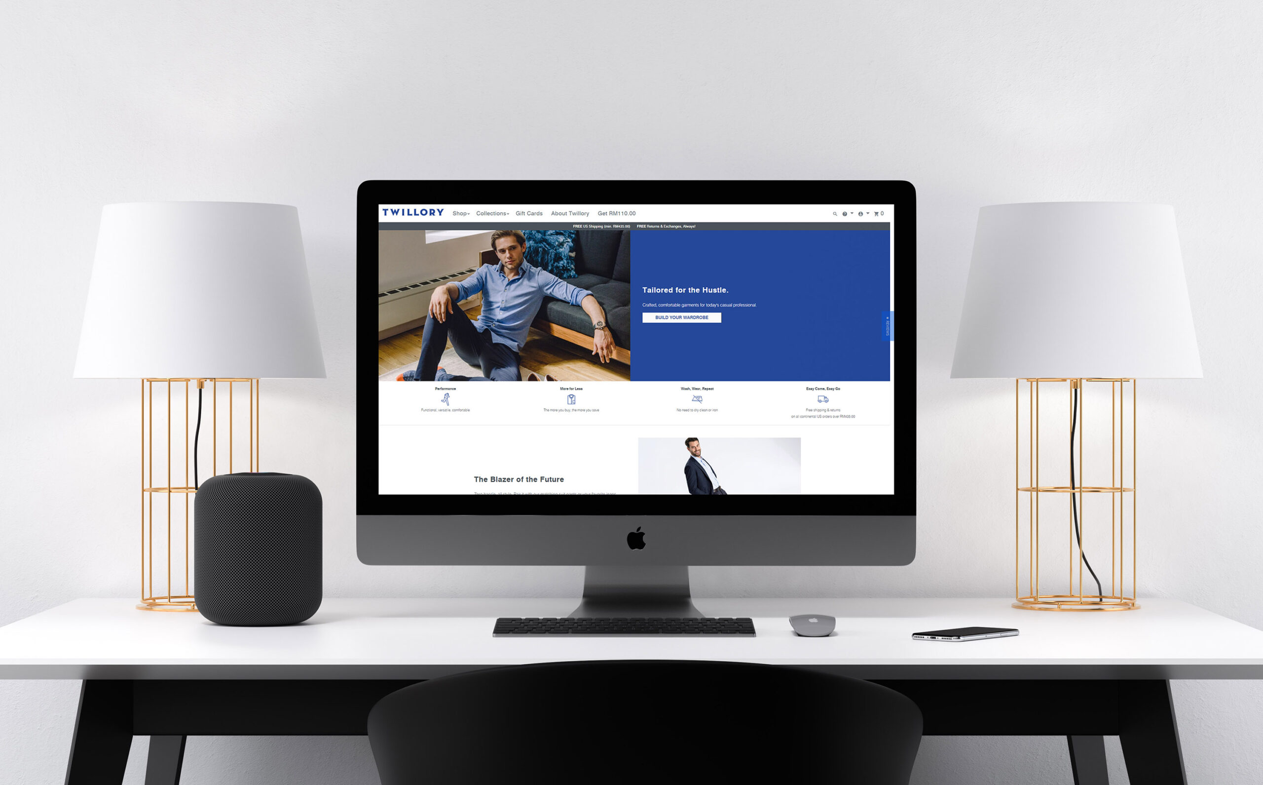
5. Twillory
Industry: Clothing – Conversion Rate: 46.85%
In 2017, mobile had become the dominant source of web traffic worldwide at 50.3%. And Twillory makes sure they jump on the right track!
The majority of consumers now procure their items from online shops and e-stores! So, if your landing page is not mobile-friendly, then you are missing out big time!
If you want, try making your landing page creation strategy mobile-first! Optimizing for mobile can help get first-time viewers down the funnel.
Better than merely building mobile-responsive pages from existing pages.
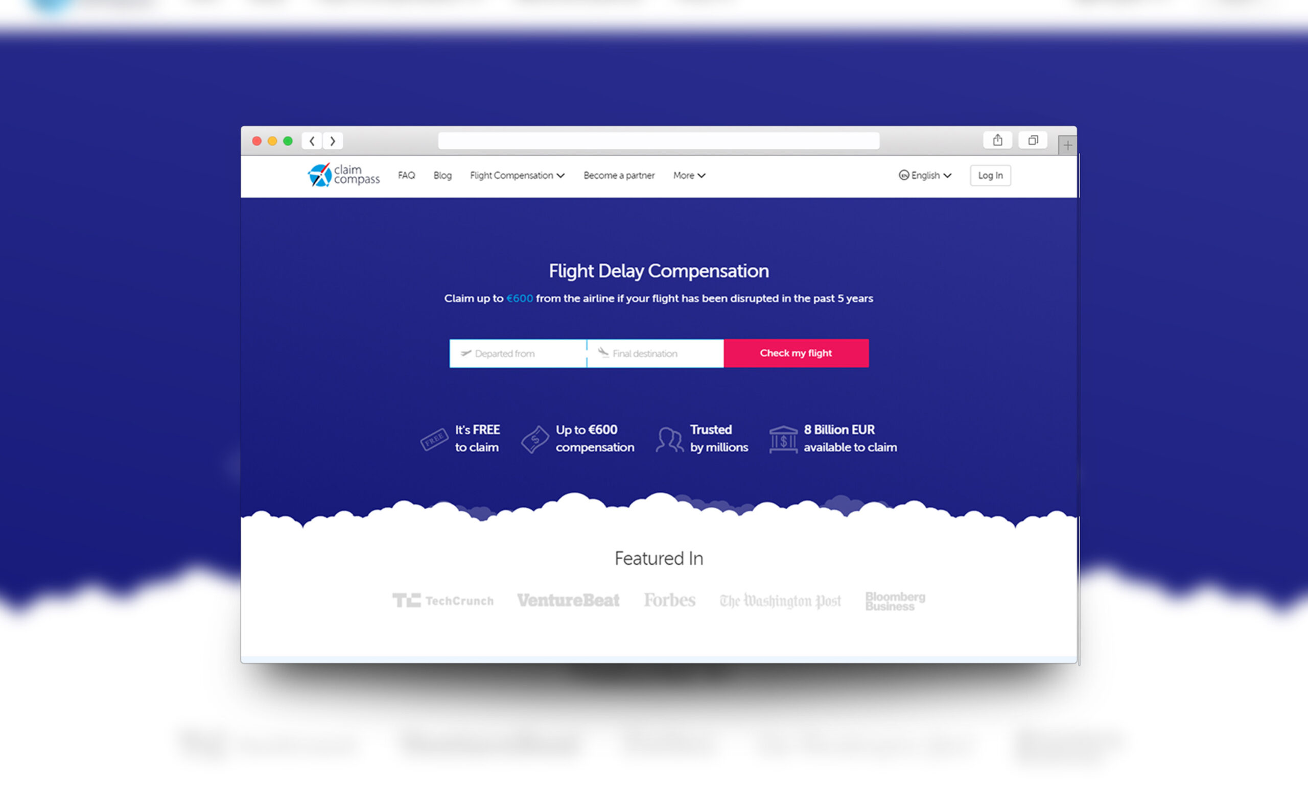
6. ClaimCompass
Industry: Legal – Conversion Rate: 30.02%
What is that old saying? “If at first, they don’t convert, try, try again”?
Ensure your visitors have enough information to convert. How to do that? Provide them valuable information and back it up with explanations on how they work! Do not just slap on media logos as social proof.
Consumers want to believe their own cliques. So, with suitable web content and copywriting, you can add more credibility to the offer easily! That is promising free money!
They provide some valuable information and back it with authority—not only the social proof and media logos but briefly explaining how it all works.
BUT, how to go forth and convert if you do not have the basics?!

The step between earning a click and generating a lead is a journey! Even after producing high-converting landing pages, some strategies need to be done to convert them into profitable leads!
And, do not assume the process is perfectly repeatable. To stay winning in the market requires you to create a website that is always relevant and consistently evolving. So, it is best to rely on web design wiz and digital marketing experts!
Brader Design—listed as one of the 23 Best Website Builder in Malaysia—specializes in optimizing your Landing Page Conversion Rate.
We are an all-in-one Online Sales Machine; experts in web development, digital marketing, funnel mastery, web design, and content copywriting. The only true website developer with proven results and sales strategy for Small to Medium Enterprises (SMEs).
Ready to quadruple your leads in the shortest time? Leave your Landing Pages to us Braders!


